The Mystery of the Ten-Dollar Bill
![]()
When American paper money was redesigned in the 1990’s to combat counterfeiting, many people did not like the new “big head” bills. Aside from the new ungainly portraiture, people missed features like the plentiful scrollwork. One change found on the back of the 10-dollar bill was that the long-standing diagonal view of the Treasury was replaced by a straight-on view. While this may seem minor, a number of stories surround this older image, particularly about the car in the foreground of the engraving.
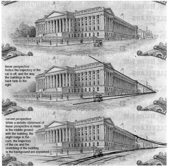
What is certain is that Louis S. Schofield completed engraving the die for the Treasury Building scene in December 1927. Some people believe the period car in question to be a Ford Model-T or a Hupmobile. However, the Bureau of Engraving & Printing has indicated the car is of no particular design, as a government agency cannot legally endorse a commercial firm or product. Another urban legend relates that if one looks under a magnifying glass, it is Bonnie and Clyde sitting in the front seats of that car. Oh, it would be ironic if a rebel engraver put two famous thieves on a piece of US currency, showing them driving right past the Treasury! But there is just not enough detail on the figures to identify them, and Bonnie Parker and Clyde Darrow did not meet until 1930. The story that concerns us is not the car’s make and model, or even its occupants, but begins with the question, “Just where is that car headed, anyway?”
The oblique view of the Treasury appears at first glance to be executed in strict Renaissance-style linear perspective. Indeed, the building looks impressively strait and orderly. But the more I looked, the more I realized that way down the street in the back of the scene, the designer starts to bend the space towards the horizon, not too noticeably. But if you draw orthogonal lines to map the trajectory of the street, you will see that the buildings and trees start to pitch to the right in the background. The same is true of the foreground: The trajectory of the car is arcing noticeably. If the scene had been drawn with linear perspective, the car would get into a huge accident about 10 seconds down the road as it turns into oncoming taffic. See how in the third picture, an overlay of a curved road puts the car heading straight down the street. I don’t know if this was done purposefully, but a lot of artists bend space without even realizing it or knowing why. And viewers don’t often pick up that it is there. Americans looked at this image for over 60 years and I’m not sure anyone noticed. That’s how pervasive, as well as ignored, curved perspective is. Why is that?
