Curved or “Unstraight” Pictorial Space in Vermeer
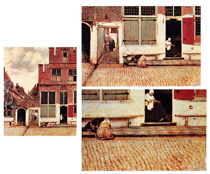
When we think of Vermeer and perspective, confidently rendered checkerboard floors may come to mind. In the foreground corners of his paintings he often countered the distinctive distortions caused by Renaissance-style linear perspective by overlapping the floors with drapes or doorways, or he just crops the compositions before the perspectival distortion becomes disruptive. These are all common approaches to countering this problem. But something very unusual happens in his famous work, “The Little Street”- His struggle with curved or “unstraight” pictorial issues becomes quite evident, and for someone who prided himself on technique his spatial solutions seem quite improvisational (fig 1).

How to depict a row of houses “straight across” has always been a problem for artists. When you stand in a street looking directly at the house in front of you, those on either side seem to drop away. If you stand further back, you can see more houses straight-on, but the curving effect still takes place. Linear perspective mimics this effect, creating ever-increasing spatial distortion as you move visually down the block in either direction. So if you want to create the effect of an ongoing unshrinking row of buildings, you can’t use strict linear perspective. The ever-increasing distortion needs to be countered and regulated,
Vermeer approaches this problem by being “purposefully unclear.” He sets up a linear perspective scheme with a single strong orthogonal line from the lower left to the bent woman’s broom. The paving stones’ overall trajectory supports this scheme, but is contradicted by the pavement’s “inner movement” which “waggles” in the other direction. This countermovement helps break the “black hole” effect of the vanishing point, but it is purposefully not strong enough to break the overall illusion of perspective. He also keeps himself from having to render most of the short orthogonal segments that would occur in the scene’s architecture, and that would visually reinforce the linerar perspective. Instead, he creates depth through localized shadows, overlapping shapes and superior rendering, as in the bricks.
I showed my findings to Tim Jennison, of “Tim’s Vermeer,” an extraordinary movie that details Jenison’s 10-year quest to recreate a Vermeer. Here is a man who notices seemingly every detail and who had not noticed any evidence of curved pictorial space in any Vermeer. He found my musings on the movement of the paving stones rather circumstantial for unstraight space. I then showed him what I though might be a “smoking gun.” While the viewer understands that a checkered floor is depicted on the right side of the painting, upon close inspection the orthogonal angle of the floor grid cannot be determined at all. Vermeer obfuscates the trajectories of the tiles by blurring some edges and corners, and by moving the tiles slightly in different directions, but not to the point of breaking the illusion of a receding floor. This allows the left-right movement of the street to flow without the black hole effect. Jenison believed that I had a point.
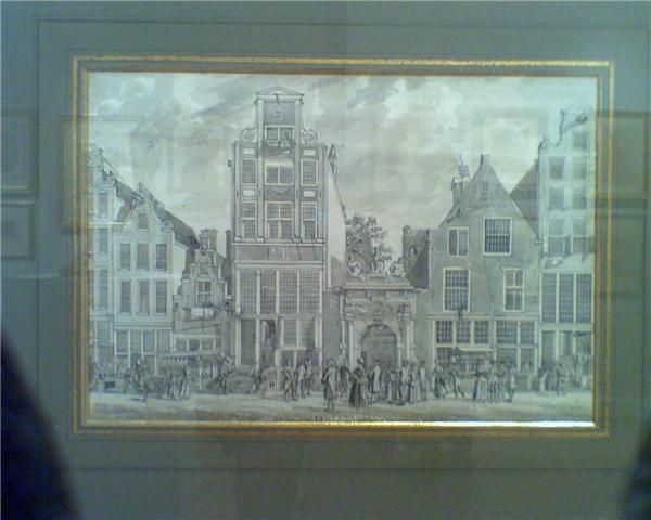
By contrast, Dutch artist Hermannus Petrus Schouten, who came from a similar place and time to Vermeer, offers a different approach to this problem in his street drawing pictured here (fig 2). While the short orthogonal segments of his buildings do meet at an unseen vanishing point, the street in the foreground is composed of an endless series of overlapping diagonal lines that are gently arced and have no common vanishing point. This is a kind of overlapping curved perspective, which can work like parallel perspective, allowing for a street scene of potentially infinite length, while also allowing for the illusionistic recession of space.It is an extremely powerful and versatile tool that I have been exploring, and look forward to sharing more about it soon.

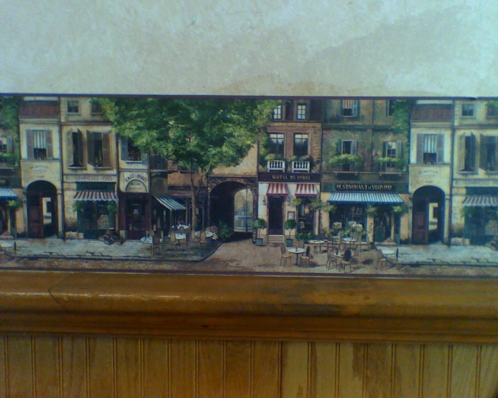
A final example comes from a cellphone picture I took of a wall in a pizzeria (fig 3). This wallpaper edging is a repeating street scene. You can see how a series of “micro perspective zones” puzzle together to create a workable, though awkward, overall space. Orthogonals are few, as in Vermeer, by they do appear with conviction in the awnings and street. lines.

All of these examples show the complexity and difficulty of combining multiple views into a single scene, and how bending space can aid in that task.